Platform
iOS Mobile App
Roles
Interaction Design
User Research
Tools
Figma
Principle
Award

Vancouver UX Awards Finalist 2019
Over the course of 6 weeks, I helped create a mobile user interface from initial ideation to a fully interactive prototype. For this third-year design course, in a design team of 5, we were tasked with designing an interface for an interactive system for a specific problem domain. Ultimately, we decided on pursuing the topic of sexual education for LGBTQ youth.
Problem
Research

The topic for this project came about during pride month, where my team and I wanted to contribute something for the LGBTQ community. After conducting secondary research on specific issues faced by the LGBTQ community, we landed on the issue of selective sexual education taught within secondary schools. To understand the people at the core of this issue, my team and I sent out online surveys to high school students to learn about their experience with learning about sexual education in school and online.
The surveys were a great start, but to gain deeper insights we decided to set up interviews with students, and teachers who primarily taught grades 8-10. The conversation of the interviews with the teachers were mostly open-ended but focused on questions such as how do students learn about sexual health and gender identity? When do students feel comfortable talking about certain topics? What type of material is covered in sexual education? What barriers prevent students from learning about certain topics? In total, our interviews consisted of 6 students and 3 teachers.
From our research, we found that 68% of our participants learned about sexual health and gender identity online, while 26% felt that there was not enough resources and support about their sexual health and identity. We also found that current sexual education curriculum in Canada lacks information that is tailored to fit the needs of LGBTQ+ youth.

Identifying Directions
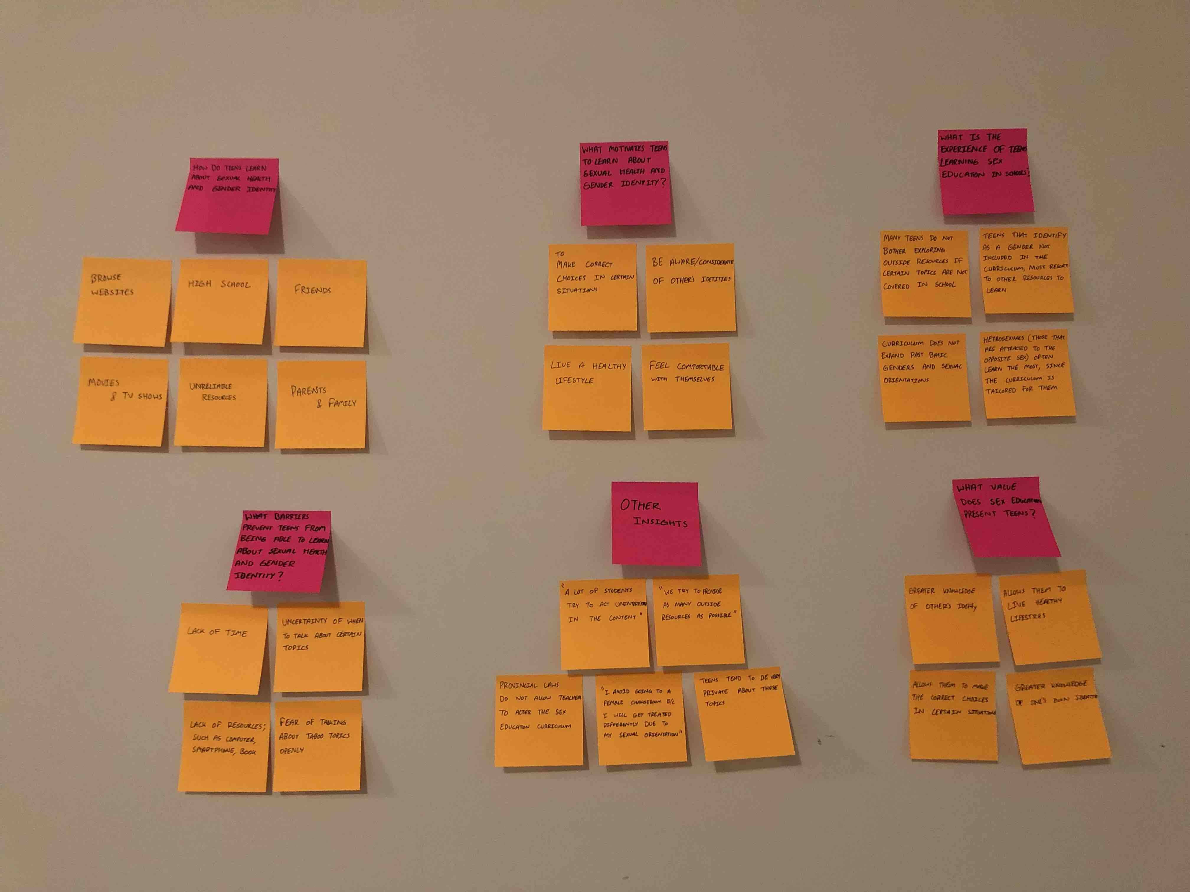
To combine our data and identify a direction worth exploring, we organized our research points and interview quotes on an affinity map. The affinity map allowed us to visualize the breadth of our interview and survey responses, identify patterns, and pick out important insights. From this affinity diagram, we were able to identify clear pain points, and frictions teens felt when learning about sexual education.
Before finalizing our concept, we set out goals that our solution could address based on our research thus far. Our project goals included:
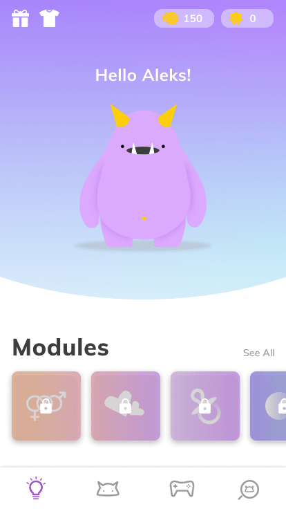
Tying together all of our research, insights, and goals we decided that a mobile application to teach teens about a wide-variety of topics in sex education would be the best solution based on the issues we found in our research.
Audience
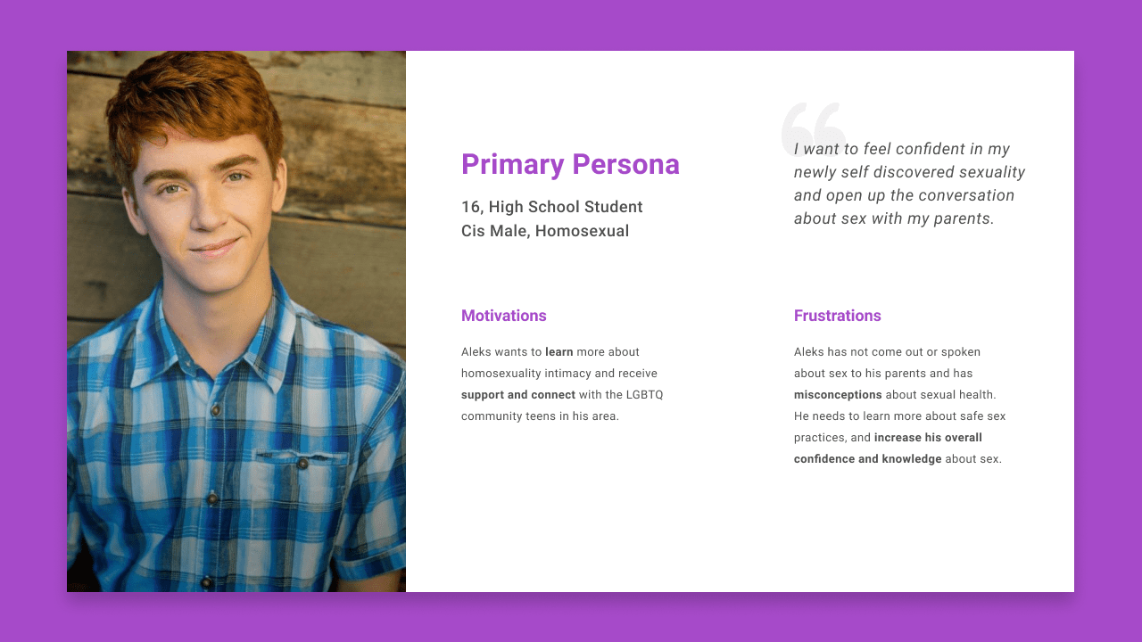
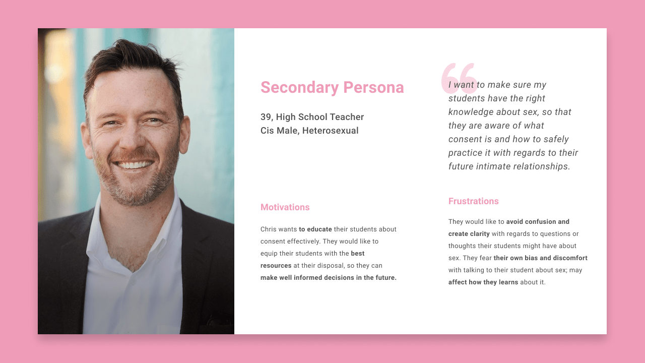
To ensure we didn’t lose sight of our target audience’s motivations and frustrations. We created a primary persona to help guide design decisions throughout our process. Because our target audience are teenagers, and considering the sensitive scope of our project. We also needed to consider the motivations, and frustrations of teachers as they would have an involvement over the content their students are exposed to. Therefore, we created a secondary persona to further help guide our design decisions.
Initial Mockups
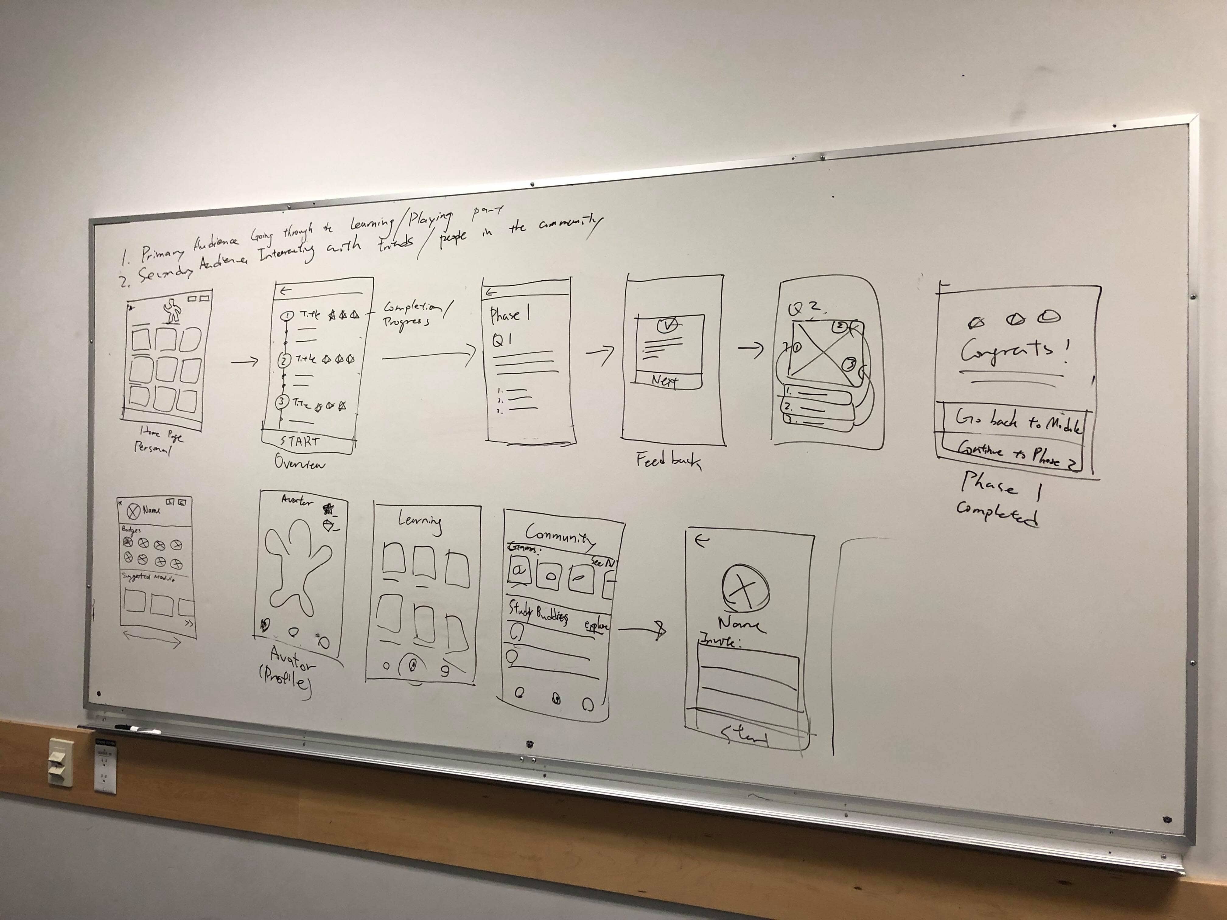
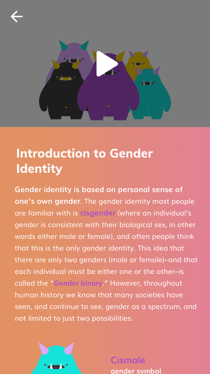
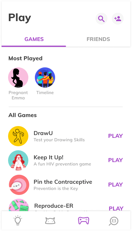
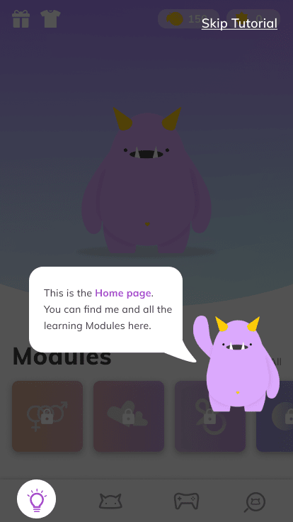
With the aid of our research and personas, we began exploring possible solutions through quick whiteboard sketches. Based on our project goals, we planned to design 3 core features in our app. A Learn feature where users can choose to read about a variety of sexual education topics to expand their knowledge. An Apply feature where users then apply what they have learned by taking quick quizzes. A discover feature where users can unlock games and read exclusive content to further their knowledge.
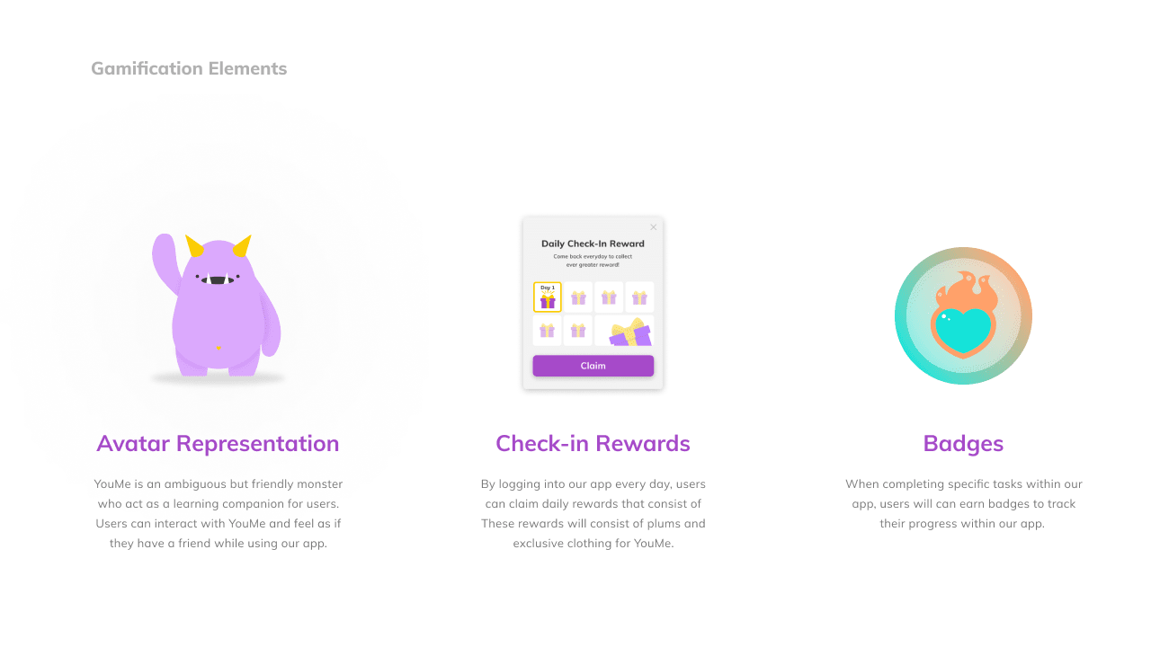
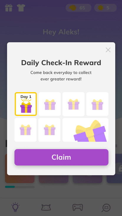
Before finalizing our concept, we leveraged other educational applications and found that gamification elements were used as an intrinsic motivation for the user to continue their learning journey. Therefore, we decided to incorporate gamification elements within our app. We then iterated on the whiteboard sketches to create low-medium fidelity wire-flows to further understand how users would move through the experience.
Style Guide
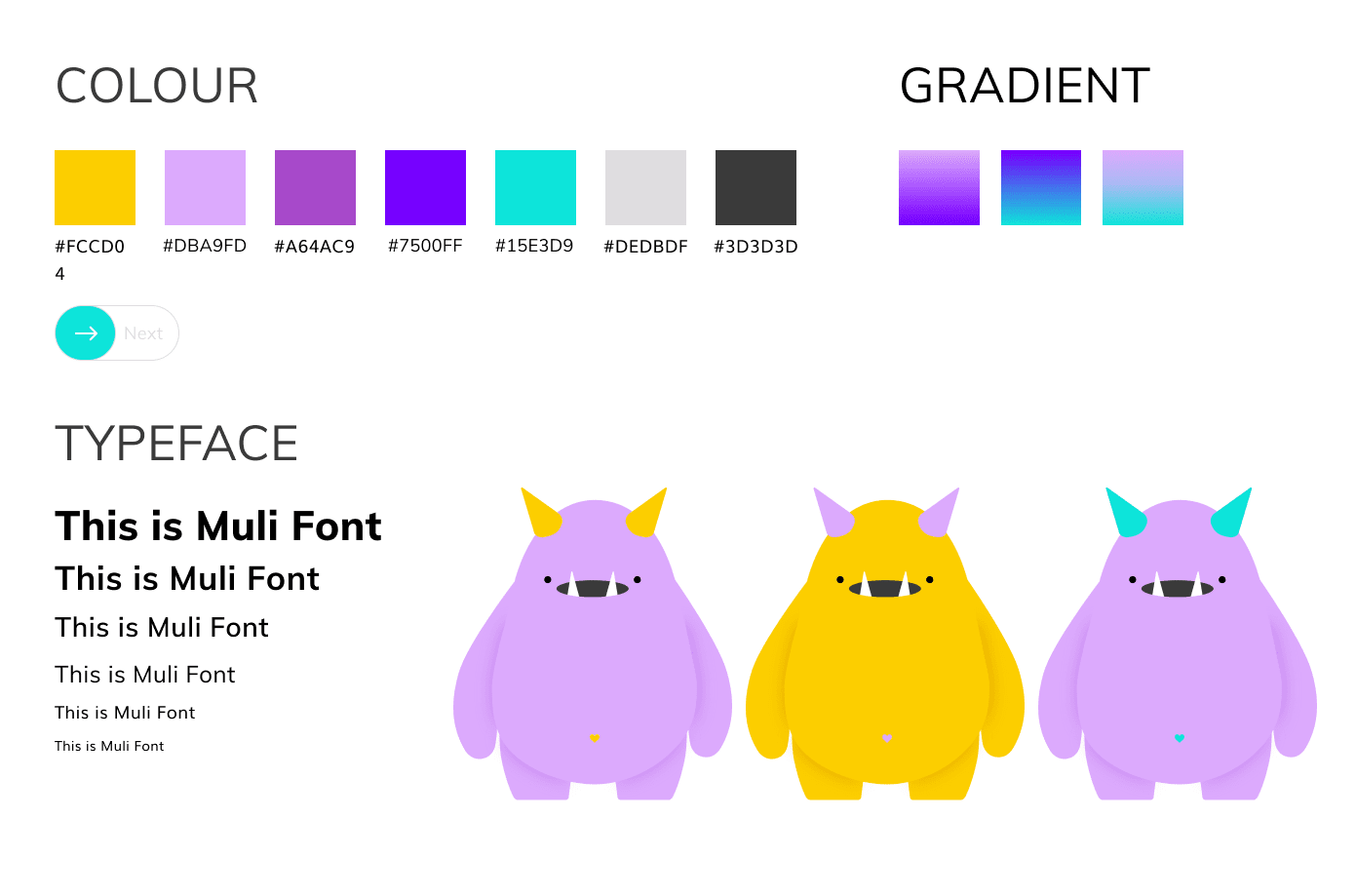
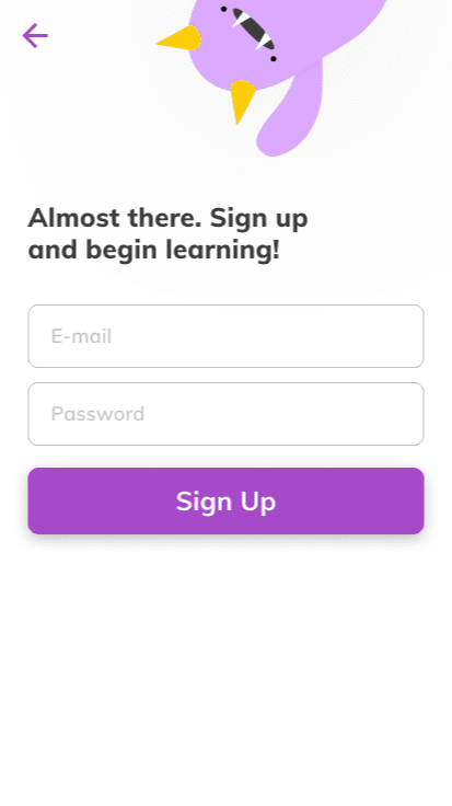
Considering our target audience of young (13-15 years old) high school students, we wanted to incorporate an overall friendly tone within our app. Therefore, our color choices were chosen with this criterion in mind.
The typeface was chosen with consideration to the sensitive subject matter of the app. We wanted to incorporate a font choice that had a serious tone so the learning material being delivered to the user would be taken sincerely.
Final Mockups
User Testing
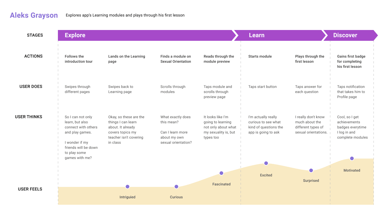
After turning our low-fidelity wireframes to high-fidelity mockups. We began conducting usability testing on our initial prototype. We decided to do our initial usability testing on high-fidelity mockups instead of low-fidelity, because we felt that the visual design of the app was an integral part to the overall experience.
Our usability testing consisted of 12 participants. Each participant was given a series of tasks to complete, when these tasks were complete, participants were then free to explore the app as they wished. While we recorded observations and comments made by the participants. The usability testing helped raise several issues in our design, and allowed us to go back and reiterate on our designs.
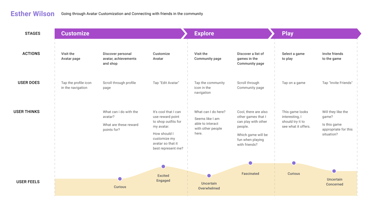
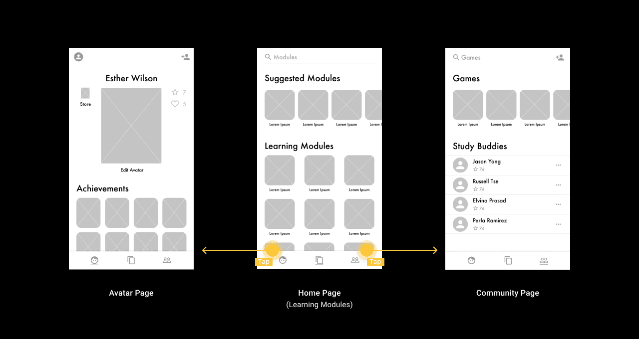
Interactions
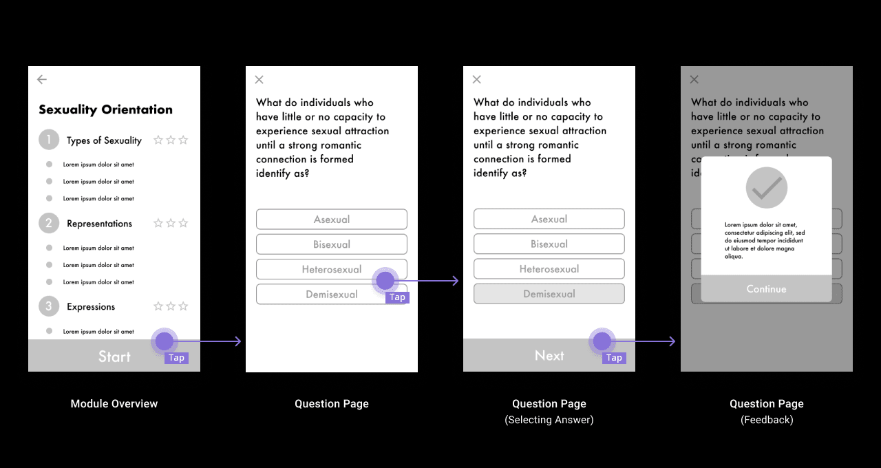
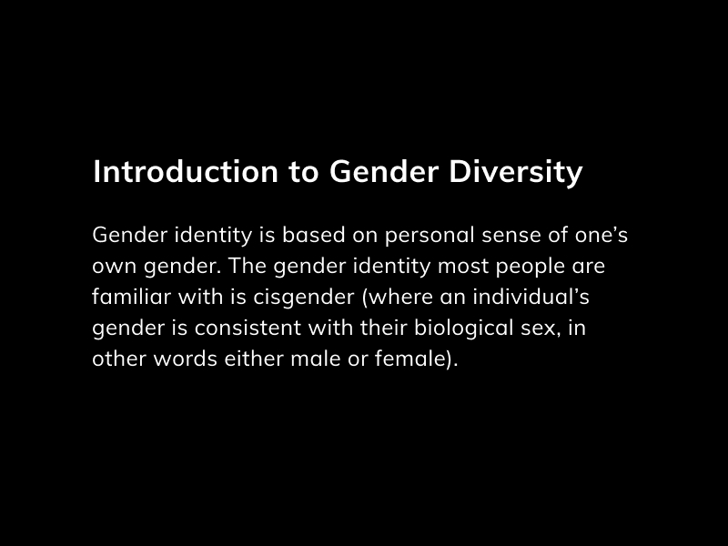
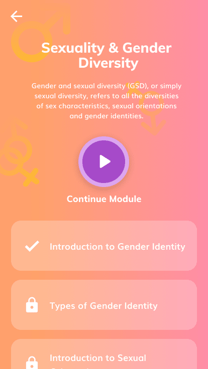
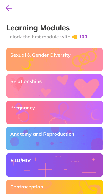
Allows users to learn about a variety of topics ranging from relationships to reproduction through informational videos and articles. Each topic is its own module with a set number of lessons you can complete at your own pace.
Allows user to apply what they’ve learned through quick and easy interactive quizzes.
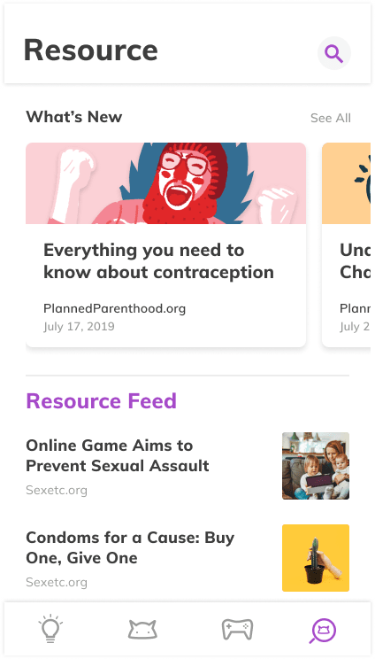
Allows users to access and read exclusive daily content to not only learn more, but also gain advice and hear about stories that they can apply in their own personal lives.
Allows users to unlock fun mini-games to play by themselves or with their friends by completing certain modules and lessons.
Allows users to spend their coins that they have earned through completing lessons, quizzes, and daily check-ins to purchase a variety of rewards to customize YouMe to their liking.
Reflection
Given more time, I would have liked to conduct more iterations of designing, evaluating, and analyzing. Which would have resulted in a more refined and overall better end product. However, because of strict time frames we were only able to do one iteration. If we decide to take this project further, I would like to collaborate with teaching professionals to design the app to be used in a classroom setting, but to do this we would need to create a class room mode where the teacher can have control.